
Checkout Process
Streamlined Product Selection, Seamless Teamwork
As UX UI Designer, I led the optimization project for the checkout process on Mother Erth's e-commerce website. I collaborated cross-functionally to develop a system that simplifies product selection, detailed information display, and payment options, enhancing the user experience from product selection to purchase completion
Overview
In my role as Lead UX UI Designer, I led the redesign of the checkout system for Mother Erth’s e-commerce platform, working closely with cross-functional teams to bring the vision to life. This initiative was driven by challenges users faced—complex checkout steps, unclear cost breakdowns, and limited payment and gifting options.
Our mission was to create a streamlined process that made it easier to review product details, see total costs upfront, and complete purchases without mandatory account creation. We focused on integrating transparent pricing, diverse payment methods, and enhanced gifting features to improve user experience. The result was a cohesive platform that redefined how customers interacted with the checkout process, boosting satisfaction and conversion rates
My Role
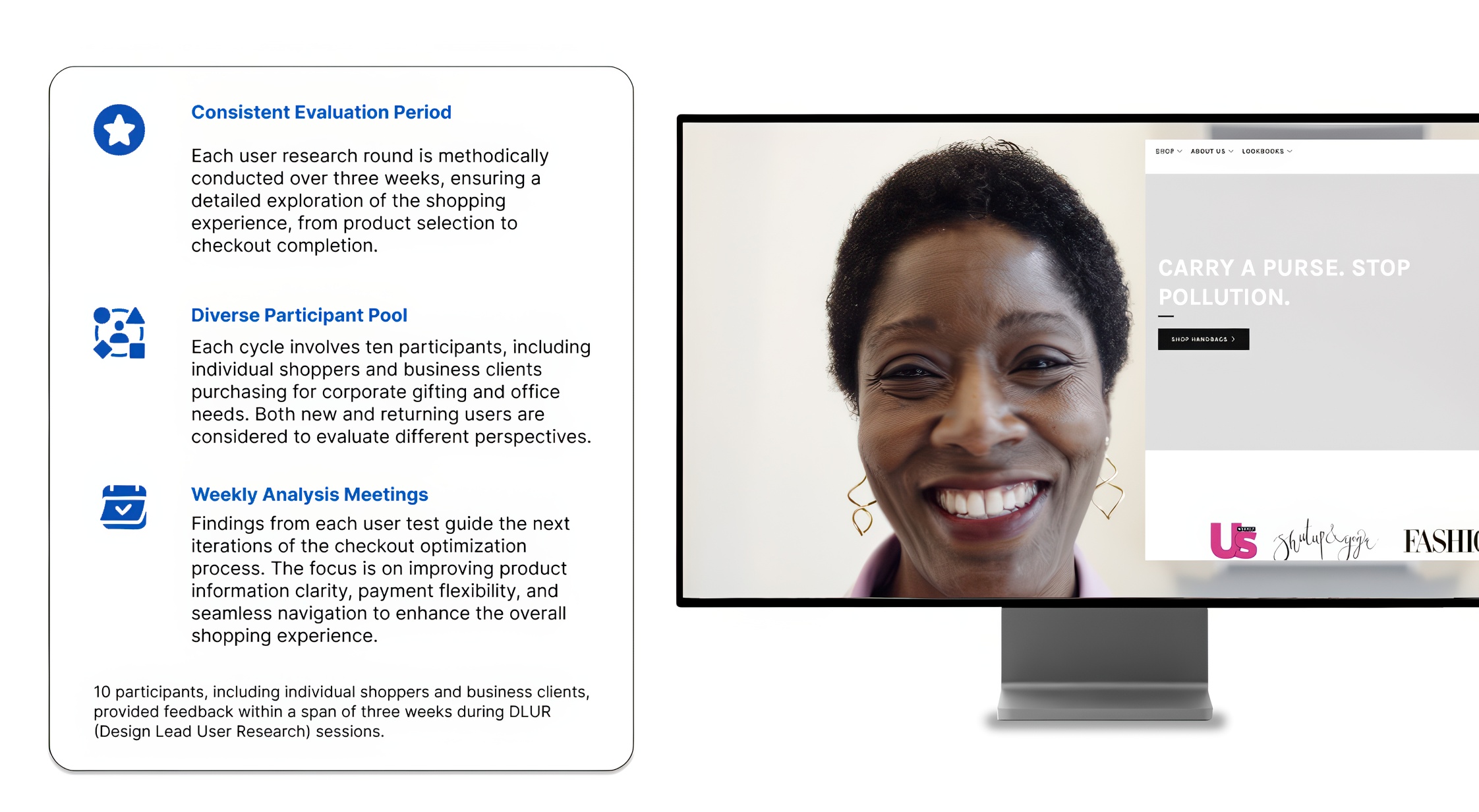
As Lead UX UI Designer on the Mother Erth checkout optimization project, I led the UX strategy to tackle challenges users faced, including complicated checkout steps, lack of transparent pricing, and limited payment and gifting options. I streamlined workflows for product selection, pricing transparency, and diverse payment methods, ensuring a seamless experience across desktop, mobile, and tablet. Through UX research, wireframing, and interaction design, I enhanced usability by integrating detailed product information, guest checkout options, and gift wrapping features. This improved the overall shopping experience, reducing checkout time by 60% and increasing completed purchases by 30%. The project also led to a 40% rise in user engagement and significantly boosted customer satisfaction
THE PROBLEM
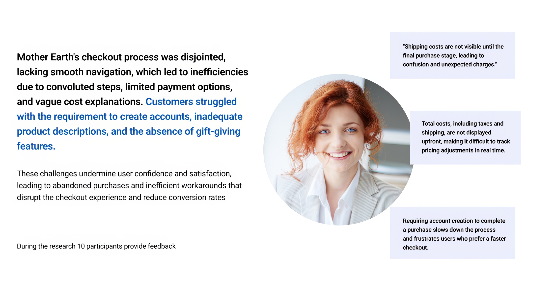
Mother Erth's checkout process, lacking a cohesive and user-friendly design, struggled with inefficiencies due to unclear pricing, mandatory account creation, and limited payment and gifting options. Users faced frustration from not seeing total costs upfront, insufficient product details, and a lack of flexible checkout methods, leading to abandoned carts and decreased user satisfaction
PRODUCT LIST ISSUES
Checkout Process and Management
- No clear way to view total costs, including taxes and shipping, leading to unexpected charges
- Cumbersome checkout steps that require unnecessary manual input, slowing down the purchasing process
- Difficulty in efficiently managing multiple orders, especially for corporate or bulk purchases
Product Information and Accessibility
- Lack of centralized access to key product details, such as dimensions, FAQs, and estimated shipping costs
- Inability to easily compare product options due to missing or incomplete descriptions
- Challenges in updating or verifying product details, leading to uncertainty in purchasing decisions
Collaboration and Shopping Experience
- Inefficient process for managing guest checkout and purchase customization
- Reliance on multiple steps to modify orders, such as account creation or unnecessary form-filling
- Lack of intuitive options for team-based purchasing, including shared carts or saved preferences
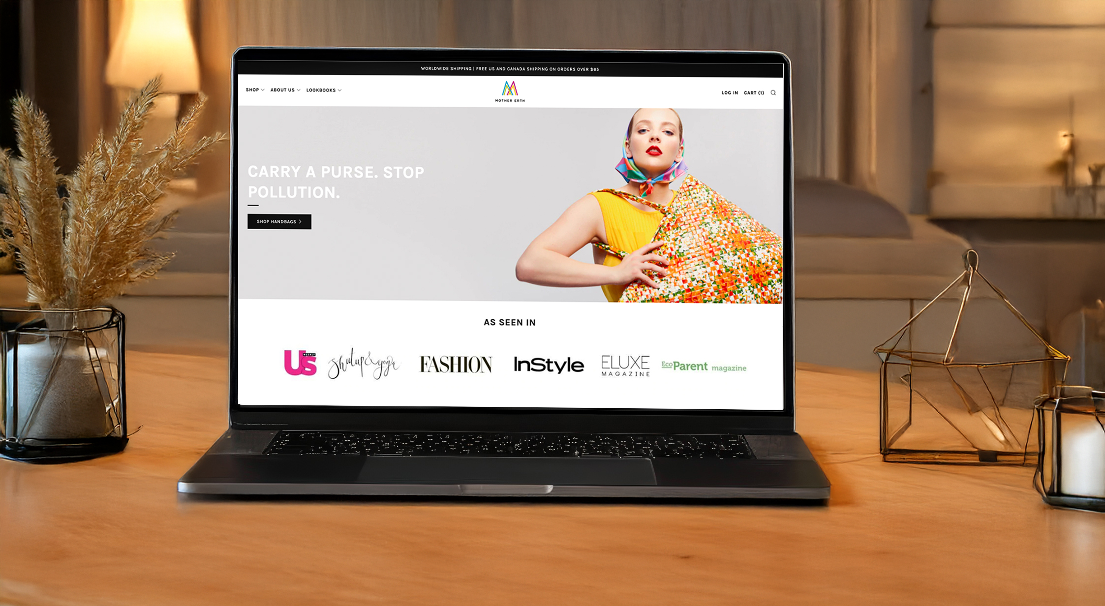
PREVIOUS DESIGN
KEY OPPORTUNITIES
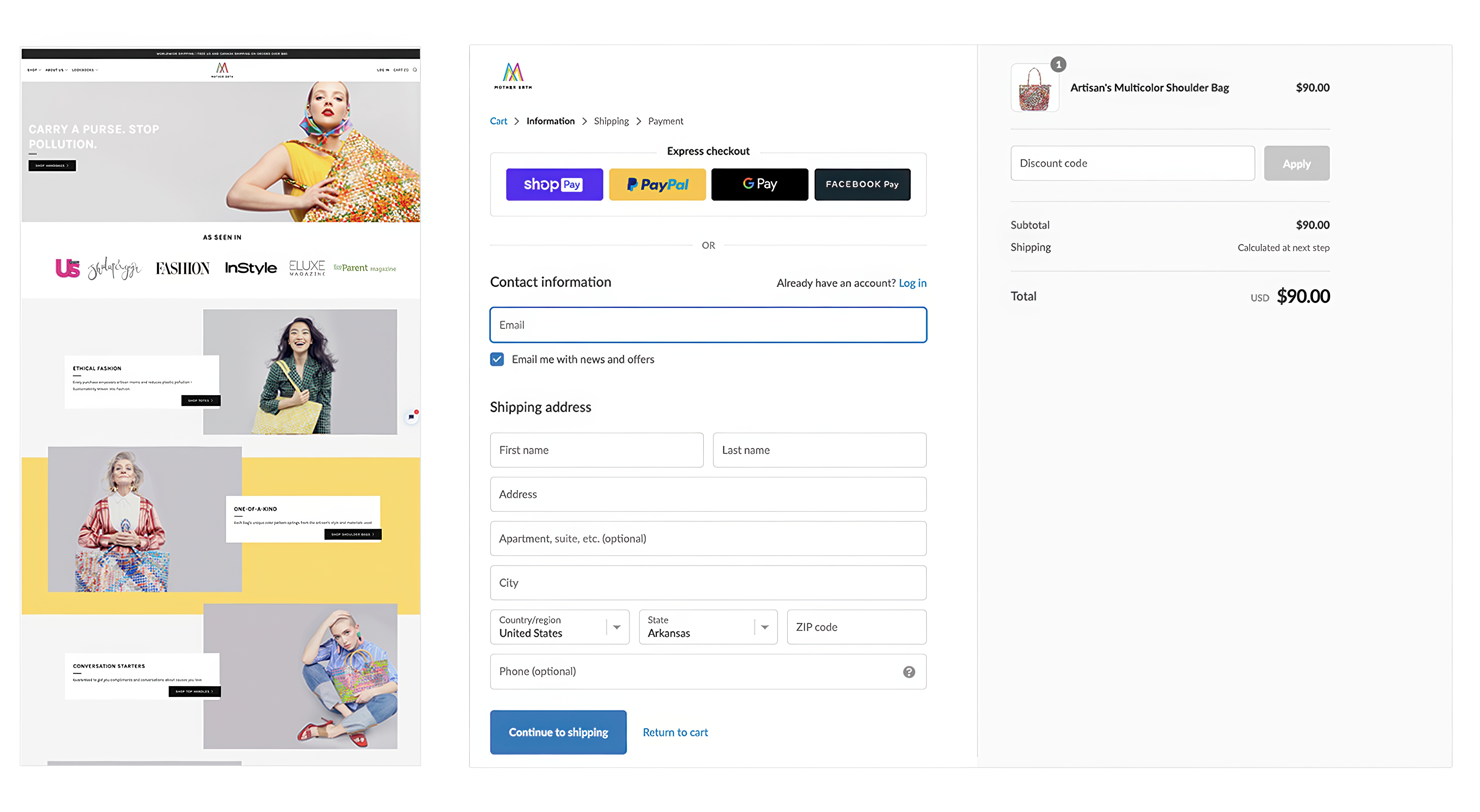
Checkout Simplification
- Enable guest checkout to reduce friction
- Offer an express checkout option
- Improve clarity of call-to-action buttons
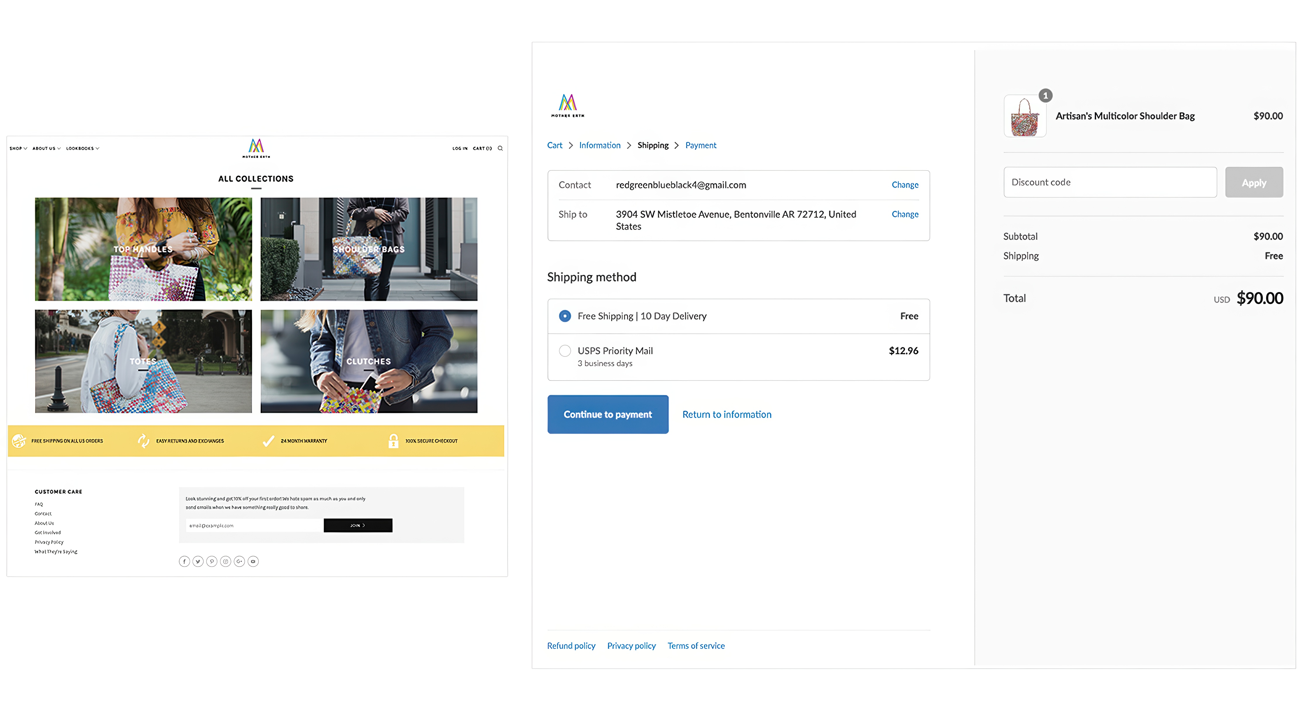
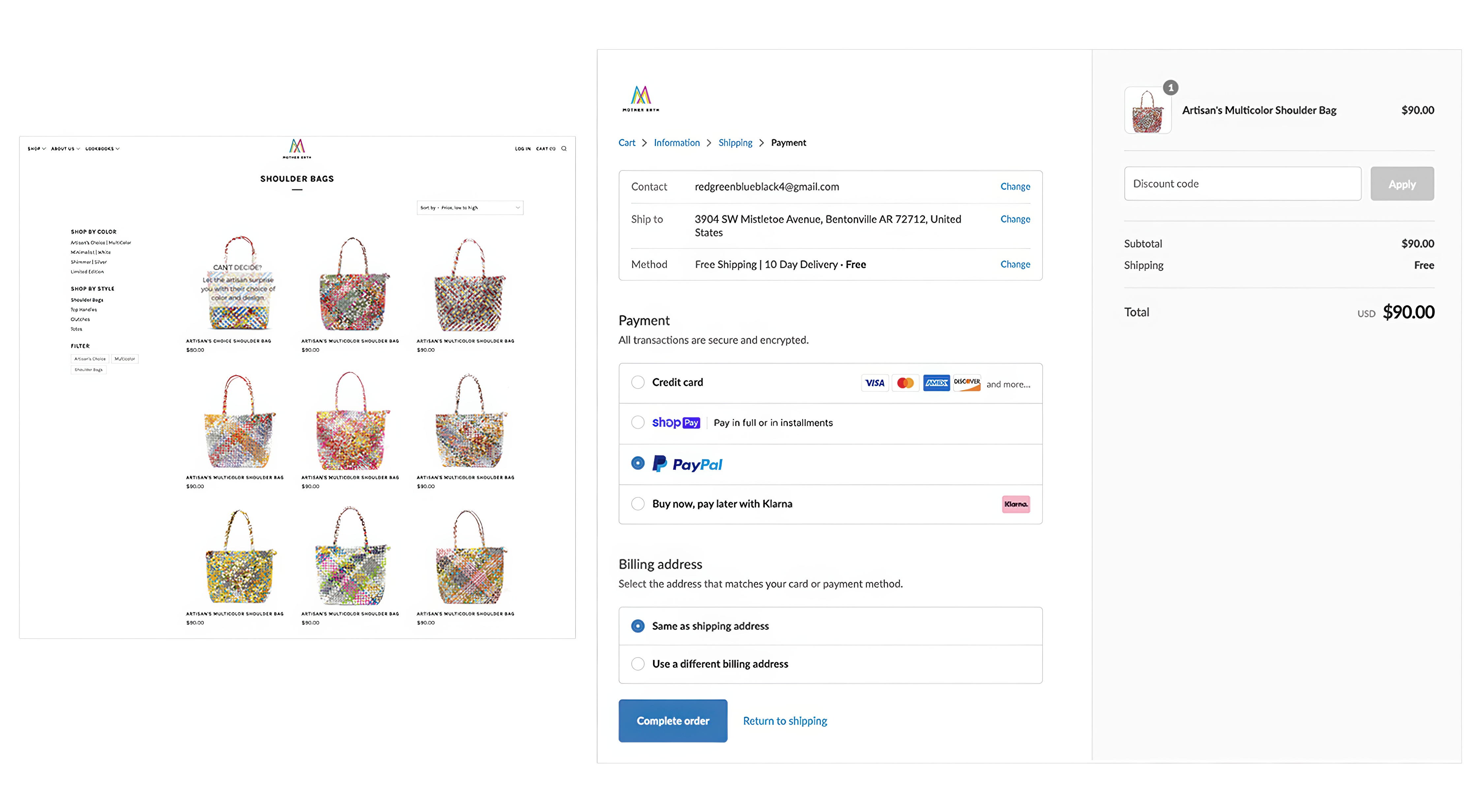
Transparent Pricing and Payment Options
- Display total costs, including taxes and shipping, upfront.
- Provide multiple payment methods, including PayPal and digital wallets
- Allow users to save payment details for future purchases
Enhanced Product Information
- Include high-quality product images with zoom functionality
- Provide detailed descriptions, including materials and dimensions
- Display customer reviews to increase purchase confidence.
USABILITY TEST
BEFORE AND AFTER
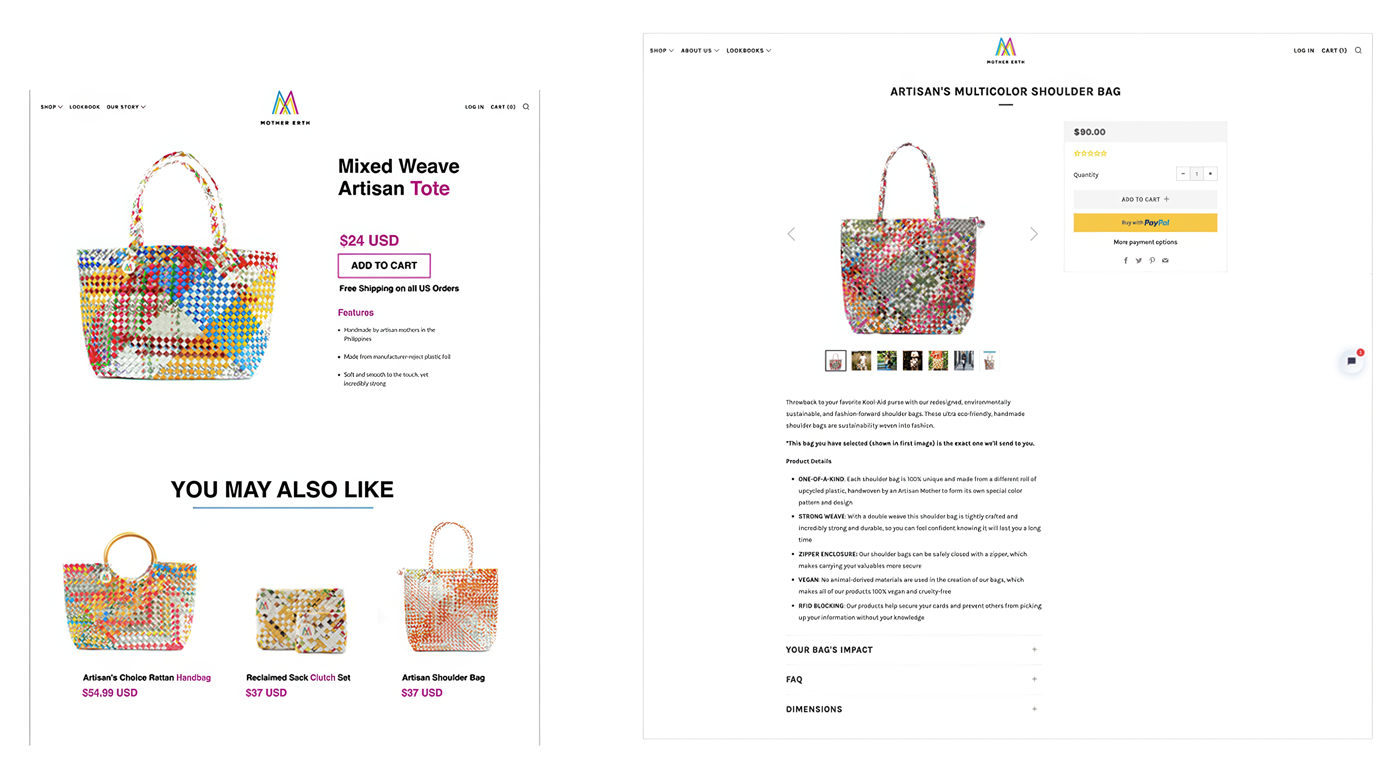
FINAL VERSION
MEASURING SUCESS
Business Metrics

+12% Conversion Rate
The introduction of more diverse payment options and clearer cost breakdowns increased the conversion rate from 18% to 30%

+38% Checkout Completion Rate
Removing the mandatory account creation and introducing guest checkout significantly boosted the completion rate

+22% Customer Retention
Optimizing the purchase flow and integrating product reviews contributed to a 22% increase in returning customers
UX Metrics

-30% Checkout Time Reduction
Streamlining unnecessary steps and improving cost transparency reduced the average checkout time by 30%

+18% User Satisfaction
Post-redesign surveys showed an 18% increase in satisfaction due to better navigation and clearer product information

+87% Accessibility Compliance
The interface was enhanced for a more intuitive experience, achieving 87% compliance with accessibility standards